 Today we are going to be looking at a really cute picture from Cooking for Pleasure. I have to admit that I have no idea about this gal because her site appears to be in Russian and I am definitely “language challenged”.
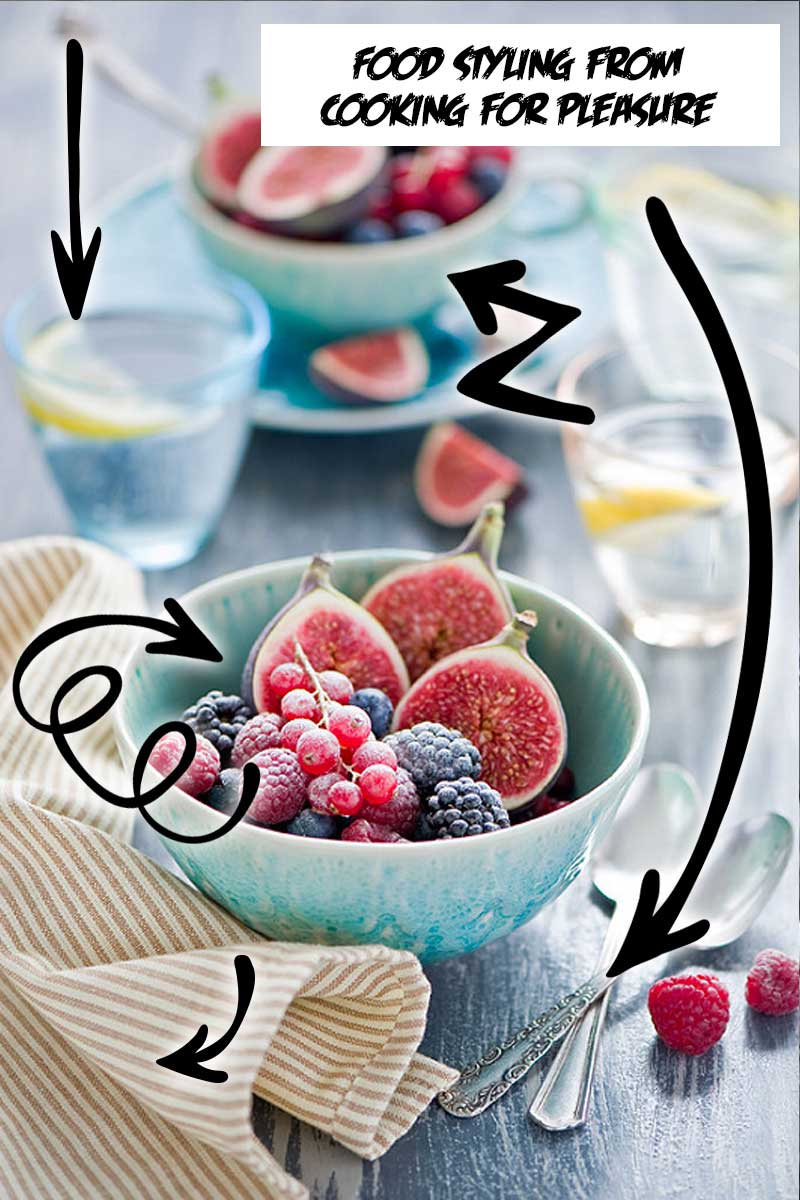
That said, her photography is stunning and beautifully styled. In fact, I had to really agonize over which of the truly epic food photography pictures that I would feature. In the end it came down to the fact that I am a little fascinated with plums right now and this one had plums! Life can be so random!
Photo Credit – Tea Party With The Mad Hatter
The Food Photography Props Review
Using multiples in her shot – One of the things that makes this such a balanced and stunning picture is the fact that she has multiples of almost everything in the shot. There are two blue containers of food, three glasses (two with lemon wedges), two spoons, and two fig wedges. It could seem like having that many items in a shot would make the picture too busy, but as you can see, it just makes for a really pleasing picture.
Clear glasses – One of the things that I haven’t talked about much is how clear glasses can add interest without increasing the “weight” of a picture. These are a perfect example. That dead space in the middle would seem funny if it were empty, but because she put the glasses with the lemon slices, there is a pop of contrasting color without adding really anything else to the photo.
Blue Bowl, Blue Cup and Saucer – I am not sure if these are the same pattern and it really doesn’t matter. The pretty sky blue color of the blue bowls is a perfect contrast to the sugary brightness of the fruit. Think of how different this shot would be if there were plain jane white bowls instead of the beautiful blue accents. Last but not least, the little shadowy darkness created by the cup and saucer really anchors that top part of the photo!
Flatware – Next are the two spoons. As you can see they are not a matching pattern which is key to keeping shots interesting. Everyone thinks that they have to have perfect props, but it is really the different and interesting contrast of these two that make the picture pretty.
Napkin – Last but not least is the tan napkin that is grounding the front of the shot. Now that I have been stalking food photographers for a while I know this is a really great trick to add texture and color to frame that bottom corner. The fun thing is that color-wise it is spot on. Blue and orange or blue and yellow are complimentary colors in the RGB color model.
There you have it, another great food photography props review. Please do not hesitate to email me (tara at marketingartfully.com) if you have a photo you would like to submit for review!

 Tara’s “tell it like it is” personality combined with her 100 miles per hour presentations have earned her the title “The Queen of Marketing Ahhh’s” from her raving fans. Check out her marketing courses and products at her Etsy Store,
Leave a Reply